Case Study
Enterprise Point-of-Sale System
I turned an acquired point-of-sale product into a cohesive, bank-owned platform that provides payment process to our small business clients. Working with external product and technology teams, I established a design foundation across payment devices, creating consistency in the current experience and a scalable foundation for future enhancements.
The Team
VP, UXD (Me)
Product Owners (External)
Eningeers (External)
QA (External)
The Timeline
12 months
Released 2026


01 – The Problem
Unexpected scale, tight delivery
When NCR ended its point-of-sale contract with the bank, tens of thousands of small business clients risked losing access to payment processing. The bank quickly acquired third-party software to maintain service. What seemed to be a straightforward transition expanded into a much larger design effort. Scope expanded significantly – hundreds of screens across multiple point-of-sale devices and device sizes (Figure 1.0).
Business Risk
Losing the existing point-of-sale solution threatened payment processing for small businesses and put thousands of client relationships at risk.
Aggressive Timeline
The fast transition left us with very little time to define requirements, evaluate design options, and improve the existing experience.
Sprawling Design Scope
Hundreds of screens across multiple devices made it difficult to understand which features were available and how the acquired software worked.
Q1 2024
Q2 2024
Q3 2024
Design

APK Vertical
200+ screens
72% scope
Handoff

APK Horizontal
200+ screens
80% scope
Handoff

Terminals
50+ screens
12% scope
Handoff
Design System
Development
APK Vertical
200+ screens
Code
Freeze
APK Horizontal
200+ screens
Code
Freeze
Terminals
50+ screens
Code
Freeze
QA
APK Vertical
Design defects
APK Horizontal
Design defects
Terminals
Design defects
Figure 1.0
TABLE
02 – The Challenge
Improving the inherited experience
After seeing what we needed to design, I quickly realized that the acquired product had severe accessibility issues, difficult workflows, and inconsistent UI (Figure 2.0). However, I couldn't increase scope further by proposing big changes. Any additional work needed a clear rationale and had to fit within the vendor architecture and aggressive MVP timeline.
Understand Funtionality
Confirm what each screen does, what action lead where, and what functionality was necessary, before changing established interfaces.
Repeat Where Possible
Reuse page templates and structures from other screens so development has less net-new changes and the experience becomes predicable.
Targeted Improvements
Prioritize practical changes that simplify tasks, clarify actions, and improve consistency without adding unnecessary complexity.

Figure 2.0
IMAGE
03 – Design Process
Every review revealed something new
Working with external product partners was a critical part of understanding the acquired software. As we reviewed the existing interfaces together, each session revealed new behaviors, unclear interactions, or functionality that hadn't been fully documented.
One example was the Order screen, where merchants build a customer’s order (Figure 3.0). Several buttons were unnecessary or duplicative, and overlapped with interactive item rows. Adding an item required opening a separate search screen, and the customer's order total remained hidden until the merchant selected "Pay".
Figure 3.0
IMAGE
In my redesign (Figure 3.1), I leveraged row components for each item, adding a quantity counter to the row for the needs of this workflow. Now, merchants could add items and adjust quantities directly on the Order screen using a counter, making the "Save" button irrelevant. Additionally, I replaced the previous "Type" sorting button with a segmented control, making the Category view more clear.
Figure 3.1
IMAGE
Clearer Actions
Removed redundant controls and unnecessary item details, making the interface easier to scan while keeping essential functionality accessible.
Less Visual Clutter
Removed item thumbnails, since merchants rarely uploaded any, and decimal quantities, since items were always sold in whole numbers
Fewer Steps
Merchants could add items and adjust quantities directly from the Order screen, eliminating unnecessary navigation and keeping key actions within reach.
Figure 3.2
VIDEO
04 – Design Process
Make a complex workflow easier to scan
Working within the vendor’s architecture meant improving the acquired software without completely reinventing how it worked. Functionality was there, but the vendor interface made it harder to understand.
Split Check on larger tablet devices was another example (Figure 4.0). This workflow allows merchants to distribute an order across multiple tickets. The task sounded simple, but the acquired's interface offered little to no guidance on how to divide items, create new tickets, or move items between tickets.
Figure 4.0
IMAGE
I focused on reducing visual complexity and making the core task easier. I reorganized the screen around a main ticket and clearly defined destination tickets (Figure 4.1). This created a more distinct separation between the original order and the tickets receiving its items.
New tickets can be created quicker and items can be split and moved easier. I also reduced the amount of detail competing for attention within each ticket, keeping item names, prices, quantities, and subtotals easy to scan. Small action icons remained close to the relevant items, while color and placement helped distinguish controls for moving or removing items.
Figure 4.1
IMAGE
Fewer Steps
Leverage layout, hierarchy, and more purposeful visual cues to make the workflow easier to understand and use.
Clearer Actions
When a split item was selected, all the other tickets had a move an item, drop zone destinations appeared.
Less Clutter
Responsive, mansonry layout
05 – Design System
Helping it scale
Across the point-of-sale experience, I built and maintained a component library for recurring UI patterns (Figure 6.0). This helped established consistency across hundreds of screens while making updates easier when I worked with product or technology on refining a design.
The bank’s internal design system provided a starting point, but its components didn’t fully account for point-of-sale device sizes. I also referenced Google’s Material Design 3 for Android-specific patterns, adapting relevant conventions to the needs of the POS experience.
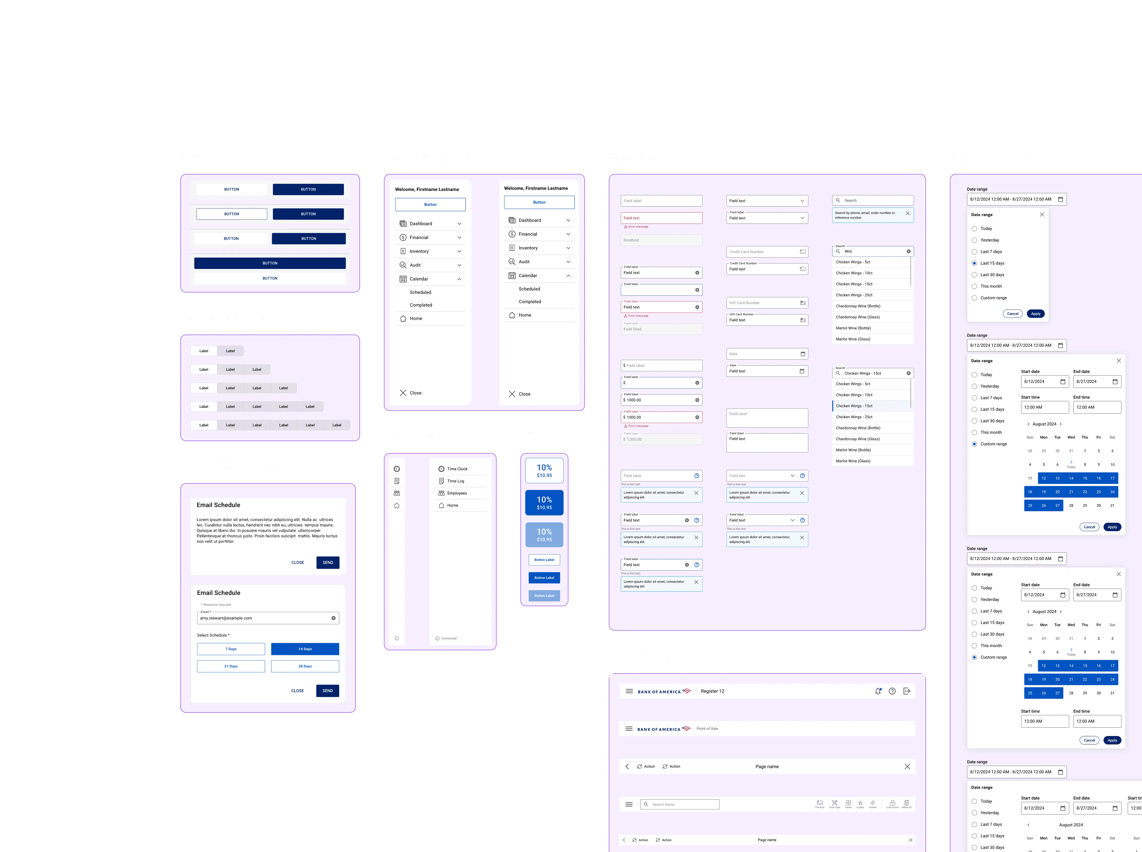
Figure 5.0
IMAGE
06 – High-Fidelity Design
Putting it all together
Lorem
Order KDS Screen in Horizontal and Vertical Layouts
Figure 6.0
IMAGE

1.0 Splash (A800)

1.0 Splash (A800)

1.0 Splash (A800)
Figure 6.1
IMAGE
1.0 Splash (A800)
1.0 Splash (A800)
1.0 Splash (A800)
Figure 6.2
IMAGE
07 – The Handoff
From design to implementation
I worked closely with the external engineering team throughout development to resolve discrepancies, answer implementation questions, and review the experience in the demo environment and on POS hardware. These reviews helped surface differences between the intended design and the implemented product, allowing us to address issues within timeline.
Because developers could reference established components rather than interpret each new screen independently, developers saw redesigned screens and went from asking “What does this mean?” to “Should we use this component here too?” – a sign that the shared system was becoming a practical tool for implementation.
Systems create leverage
Creating a shared system gave design and engineering a common reference, helping the team apply established patterns rather than solve the same problems repeatedly.
Clarity is a team effort
Design decisions relied on understanding undocumented behavior, but constant design, refinement, and collaboration with product and engineering partners made it possible to move forward with greater confidence.
Small decisions scale
A clearer control, a consistent pattern, or a better defined interaction might seem minor, but across hundreds of screens those decisions helped establish a more coherent experience.
A composition of screens across environments with annotations highlighting shared patterns / size differences
Figure 7.0
IMAGE


Figure 7.1
IMAGE
08 – The Result
Balancing urgency with intention
The initial business need was to replace the point-of-sale software. But delivering a replacement also meant making the inherited experience understandable, consistent, and practical across different devices.
Not every inconsistency required a new solution, and not every opportunity justified expanding the scope. I approached the work by looking for improvements that could scale: clearer workflows, reusable patterns, and decisions that engineering could carry consistently across the product.
"Hunter's decision-making, partnership approach, and attention to detail were critical to delivering against an aggressive timeline with shifting requirements."
Chelsea Brierton, Design Lead
When facing an ambiguous redesign, systems created leverage and consistent collaboration provided clarity. We made significant improvements without solving every problem independently or expanding scope unnecessarily.
Assets transferred annually
Clients empowered