Case Study
Merrill Edge Asset Transfer
I designed and delivered the new digital asset transfer experience for wealth management clients. The new experience modernizes how client's can transfer investments from their external financial institution to Merrill, supporting broader transfer types.
The Team
VP, UXD (Me)
SVP, Digital Director
Product Managers
Engineers
The Timeline
8 months
Released 2027


01 – The Problem
Relying on an API for transfer speed
Transferring assets between investment firms is inherently complex. Clients must manually enter the destination account, external account, ownership information, and securities to be compatible.
Our current transfer experience is old, antiquated, and only on the web. I designed a faster, responsive solution that leveraged an open finance API to prep-populate data from the client's external brokerage.
Account Eligibility
Clients need to select corresponding account types, such as Roth IRA to Roth IRA, rather than choose an ineligible account from the start.
Incomplete Data
The API could return missing or incorrect data that wouldn't line up with Merrill's requirements, which could make the entire transfer void.
Asset Selection
Clients needed to specify what to transfer and how much to transfer, which could vary from very small to very large transfers.
02 – The Requirements
Starting with what we already knew
I referenced the current manual transfer experience and mapped what the open finance API could streamline based off of data it could retrieve. This defined sequence of screens, architecture, and what we needed to design (Figure 2.0). Clients would select their Merrill account, select an eligible external account, then choose assets to transfer into Merrill.
01
Account Selection
Merrill destination account selection
Connect with external brokerage
External account selection
02
Asset Selection
List of securities
Amount of shares/cash
Full transfer vs partial transfer
03
Review & Submit
Destination account
External account
Assets to transfer
Terms & conditions
Figure 2.0
VISUAL
03 – Design Exploration
Solving an imperfect backend with UI
We expected the API to provide external information needed for a quick and easy transfer, but what would happen if any of the data was missing or incorrect?
If the API returned all the external information we needed, then clients only needed to choose assets. Others might need to confirm their name if their external account didn't match their Merrill account. Others might need to provide their external account number, account type, and other account details. I worked with product partners to understand which information was always required, what the API could capture, and when the experience needed to collect more details (Figure 3.1).
01
Required
Account Selection
Merrill account selection
Connect with external <FI>
<FI> account selection
02
Required
Asset Selection
List of securities
Amount of shares/cash
Full transfer vs partial transfer
03
Conditional
Account Details
Primary account holder
Account number
Account type
Joint account holders
Margins and options
04
Required
Review & Submit
Destination account
External account
Assets in transfer
Terms & conditions
Figure 3.0
VISUAL
04 – The Constraint
Making large transfers manageable
The API backend imposed a limit on asset selection – clients exceeding 50 securities could only transfer their entire account or only up to 50 securities individually. However, if a client holds ineligible assets, such as cryptocurrency or proprietary funds, then clients with over 50 securities were forced to make a partial transfer.
I worked with product partners to visualize a full transfer with over 50 securities (Figure 4.0) and a partial transfer with up to 50 securities (Figure 4.1).


Figure 4.0
IMAGE


Figure 4.1
IMAGE
Interstitial Question
While I explored other design solution, a radio question fulfilled the requirement without requiring the clients to understand underlying rules and complexity.
Two Paths
Choose a full transfer would take clients right to the last screen, while a partial transfer would allow clients to choose up to 50 securities.
Tailored Asset Selection
An asset counter made the selection limit visible, while contextual messaging explained when clients needed to change their selections and why.
05 – Design Process
Making asset selection quick an easy
I leveraged a data table to organize dense information and inputs into predictable columns – asset name, ticker, selection status, and transfer amount. This also worked well accessibility and for large and small breakpoints (Figure 5.0). Screen readers could announce controls, asset names, and selection counts announced as they change.
Lastly, full transfers were the most common type, so preselecting assets on page-load reduced the work required for a full transfer while preserving the flexibility to make a partial one.
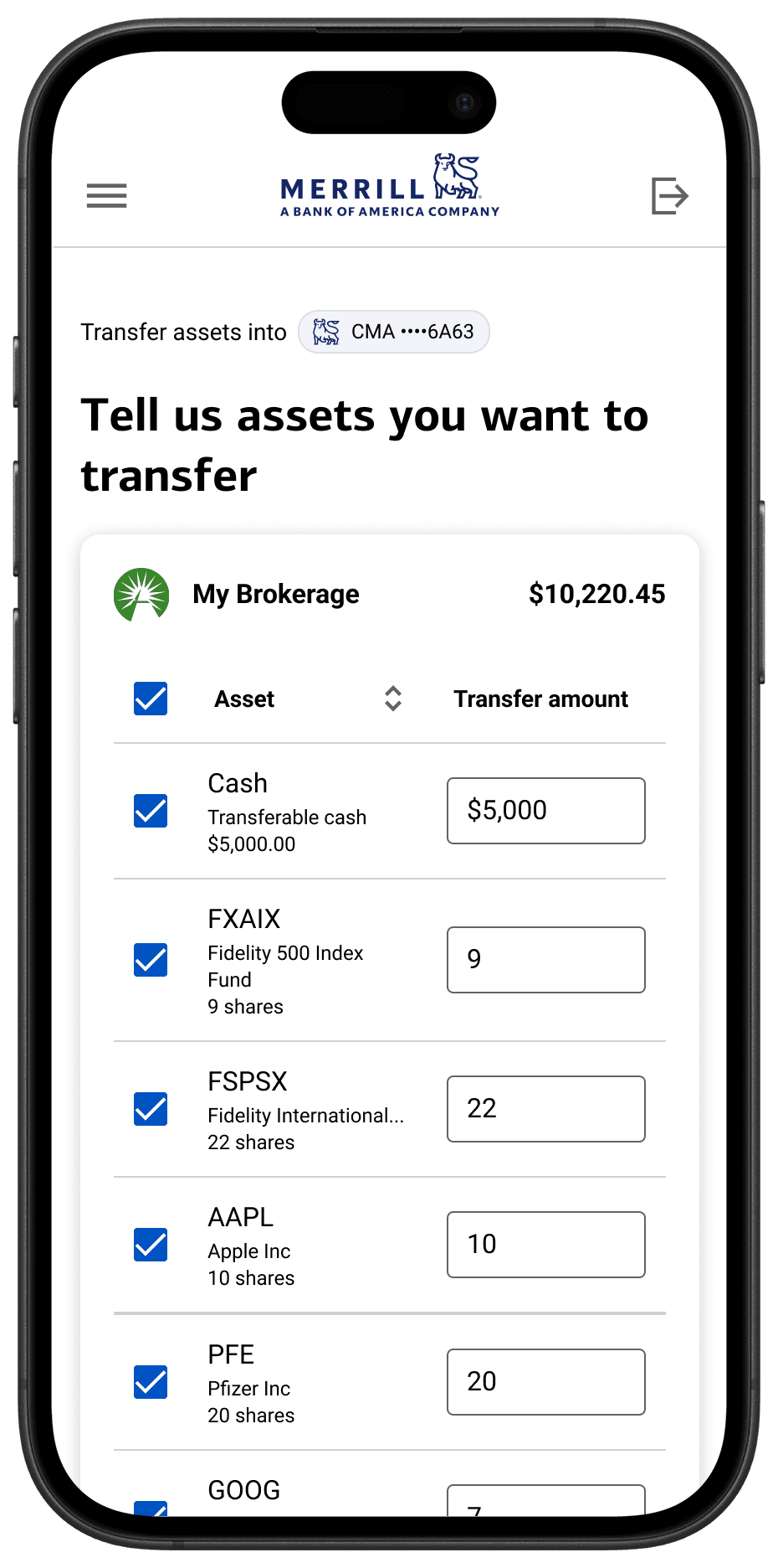

Figure 5.0
IMAGE
06 – Usability Testing
Finding the point where clients got stuck
I partnered with design research to test our approach to the new asset transfer experience. I created a click-through prototype from connecting to an external financial institution to selecting assets to transfer over to Merrill. In the study, 65% of participants completed a transfer task with ease, but the remaining 35% of clients abandoned it at the same point.
Instead of deselecting a security, clients entered $0. When the interface returned an error, they didn't know how to recover and abandoned the transfer.
I explored two ways to address this. One was to synchronize the checkbox and amount input (Figure 6.0). Selecting or deselecting a security would update the textbox, and changing the textbox would update its selection state.
The second was removing the checkbox and using the amount field alone to determine which assets would transfer (Figure 6.1). Clients could enter the amount to transfer or enter $0 to exclude a security, removing the need to manage separate controls that could perform the same task.

Figure 6.0
IMAGE
Checkboxes preserved a familiar way to select and deselect multiple securities, including a select-all control.
Synchronizing two separate controls introduced accessibility and dev implementation concern.
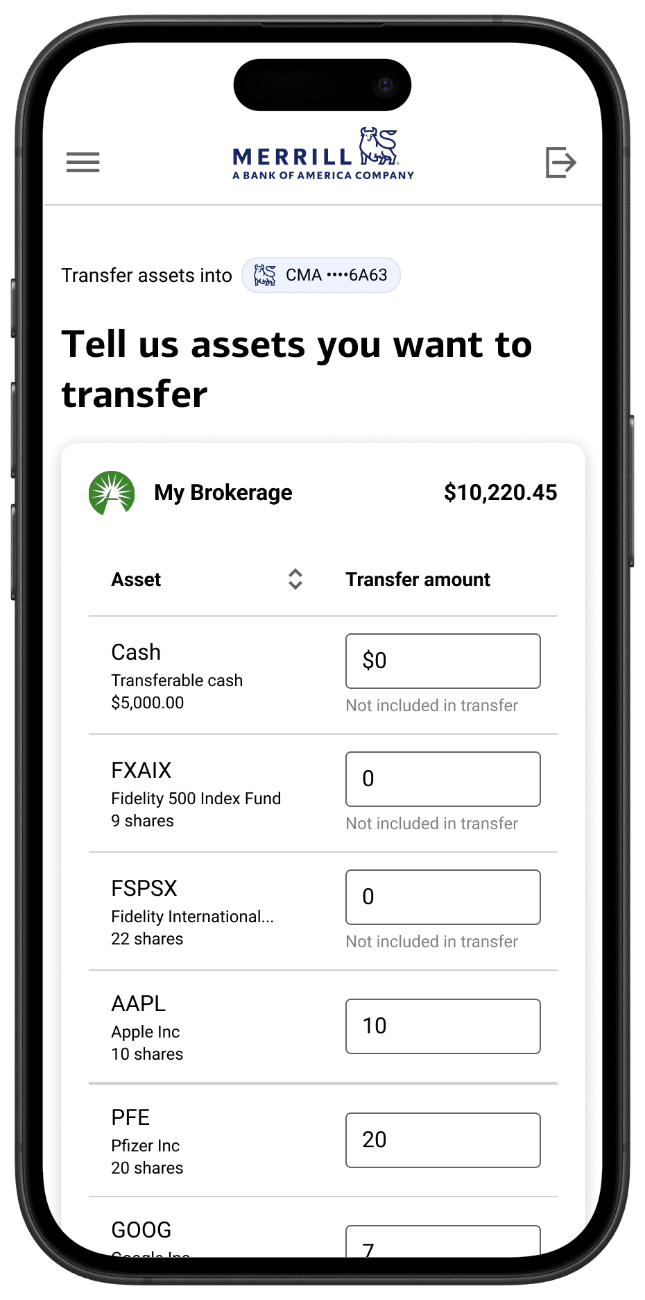
Figure 6.1
IMAGE
Some clients already treated the textbox as the way to exclude a security – lean into this mental model instead of understanding two controls.
Removing checkboxes reduced the number of controls, but also removed a familiar way to select and deselect securities.
Keeping both controls gave clients more flexibility, it was just a matter of making them work together. I prototyped the relationship between the checkbox and amount field across every interaction state (Figure 6.3). Entering $0 deselects the asset, while deselecting an asset set its amount to $0. On the flip side, entering an amount greater than $0 reselects a deselected asset, while reselecting an asset requires users to enter a new amount.
I reviewed this prototype with our accessibility partner, who confirmed the interaction was feasible. I then walked the development team through the behavior and confirmed it was technically achievable. I documented the interaction rules as a new requirement, giving developers a clear design behaviors to implement.
Figure 6.3
VIDEO
07 – High-Fidelity Design
Designing for every transfer scenario
With the key interactions defined, I translated the experience into high-fidelity designs covering the core transfer experience (Figure 7.0), conditional content (Figure 7.1), and aggregated errors (Figure 7.2). I walked product and technology partners through each screen and user flow, showing how the experience should work and respond as clients moved through the transfer process.


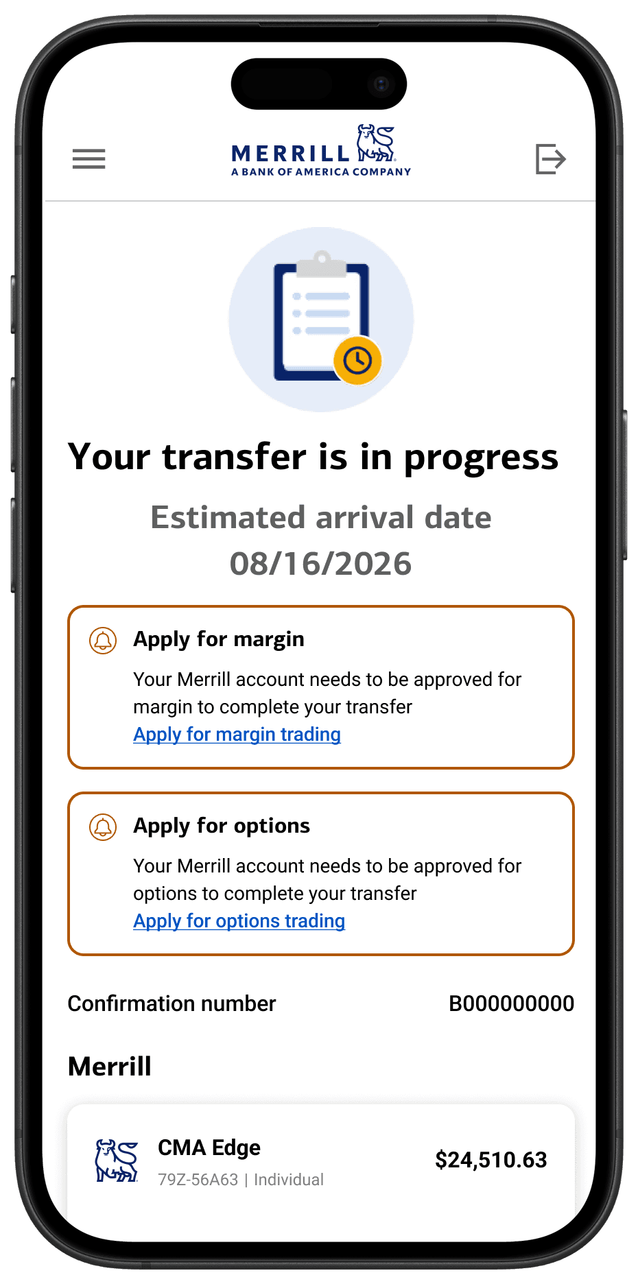
Figure 7.0
IMAGE


Figure 7.1
IMAGE


Figure 7.2
IMAGE
Show component preview for TOA
Figure 7.2
IMAGE
08 – The Result
Designing within constraints, without compromising the experience
Previously, clients had to manually provide information to transfer securities between firms. The new experience used existing account data to determine what was possible, asking for additional information only when needed. This allowed clients to focus on what they wanted to transfer to Merrill, rather than navigating the complexity behind the process.
This project reinforced the importance of designing within technical realities, not just the happy path. By translating backend rules and technical constraints into clear interactions, I created an experience that could adapt to real-world scenarios without passing that complexity on to clients.
"Hunter's decision-making, partnership approach, and attention to detail were critical to delivering against an aggressive timeline with shifting requirements."
Chelsea Brierton, Design Lead
The challenge wasn't just simplifying a manual flow – it was translating backend rules, imperfect data, and transfer restrictions into a overall better experience that clients would enjoy.
Net assets transferred annually
Merrill clients supported