Academic Research Site
Transforming a static search gateway into a complete research experience.
My Role
UX Designer
User Research, A/B Testing, High-Fidelity Prototype
Team
Product Managers
Marketing Director
Lead Developer
Timeline
May - Aug 2021, 4 months
Technology
Figma

Balsamiq
Overview
I led a landing page redesign used by millions of researchers worldwide. The goal was to transform a static search gateway into a more complete research experience.
Working with product managers, marketers, and developers, we created a landing page that addressed immediate usability needs and long-term product goals.
1
The Problem
Where We Are Now
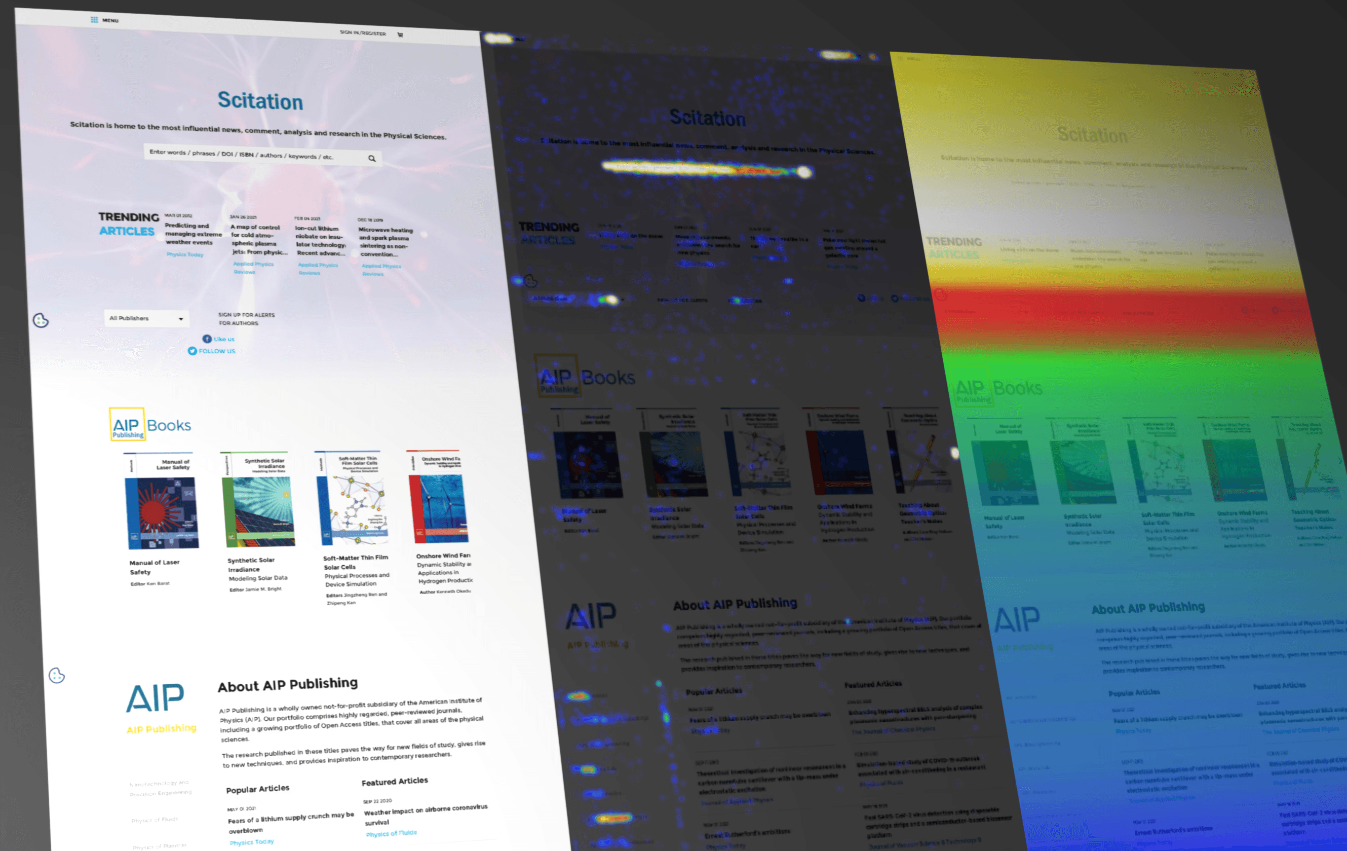
The landing page was extremely outdated and difficult to navigate. I used a web tracking tool to understand current user behavior and interactions Two major insights stood out.
High Drop-Off
90%
of users left the page off below the fold.
Reliance on Search
80%
of users only clicked the search bar, ignoring other resources.
What I Set Out to Solve
The website's search-first approach created a limited experience for millions of students, scientists, and researchers. It needed to evolve from a static search gateway into a complete research experience.
Dense to Discoverable
Turn dense academic information into scannable layouts – balance clarity with depth.
Preserve Search
Ensure search remains fast for existing users – balance innovation with predictability.
2
Concept & Testing
One Page, Many Needs
I met with product managers to better understand and visual the broad user base.
This helped prioritize improvements for the landing page, specifically for those exploring topics without a specific search.
Two Different Proposals
I analyzed leading academic research platforms to identify common layout patterns that have shaped user expectations.
I put together two wireframes that proposed different solutions to search, resources, and content on the page.
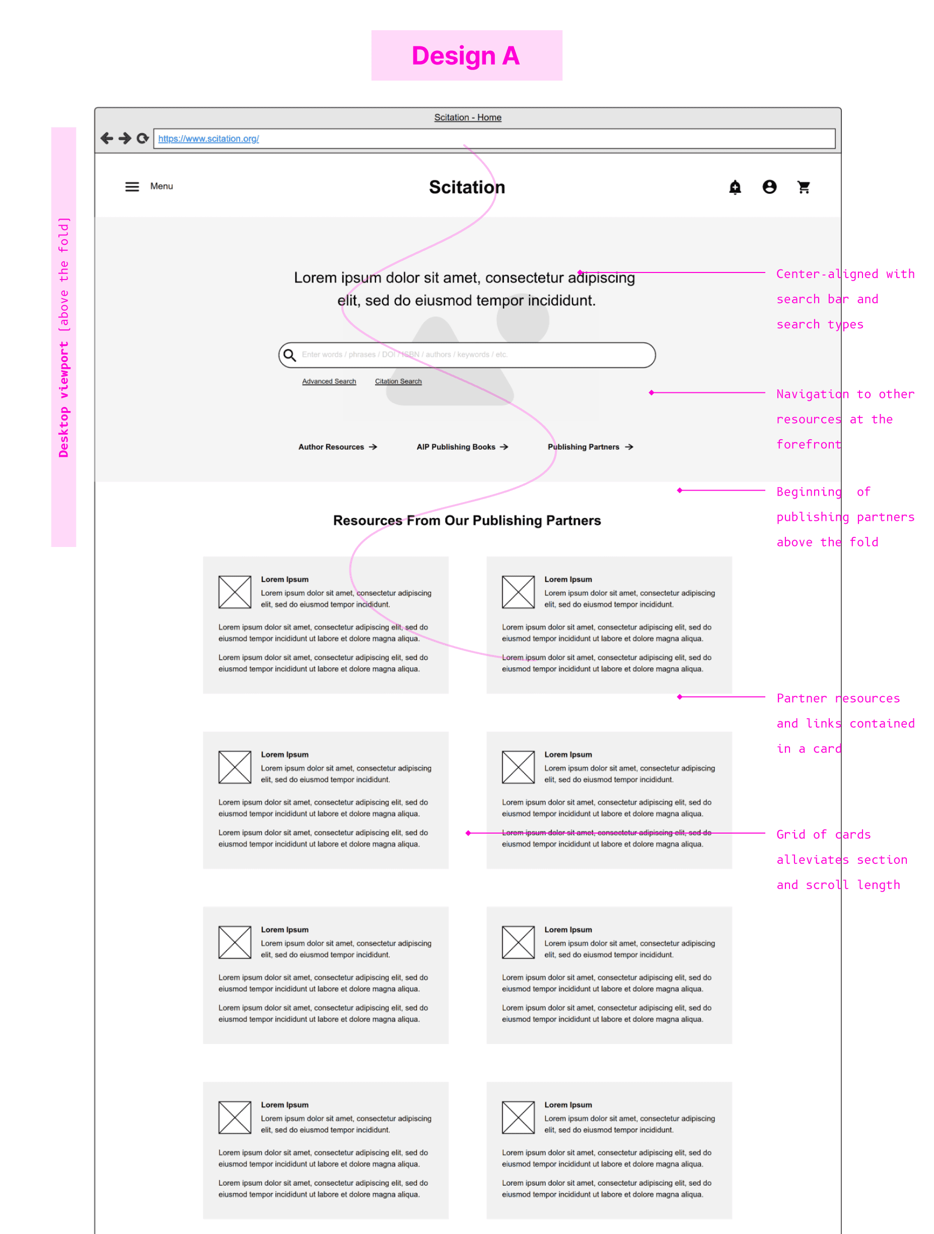
Search-first layout minimizes disruption, while surfacing more actions above the fold.
Important content still required scrolling and lacked strong hierarchy.
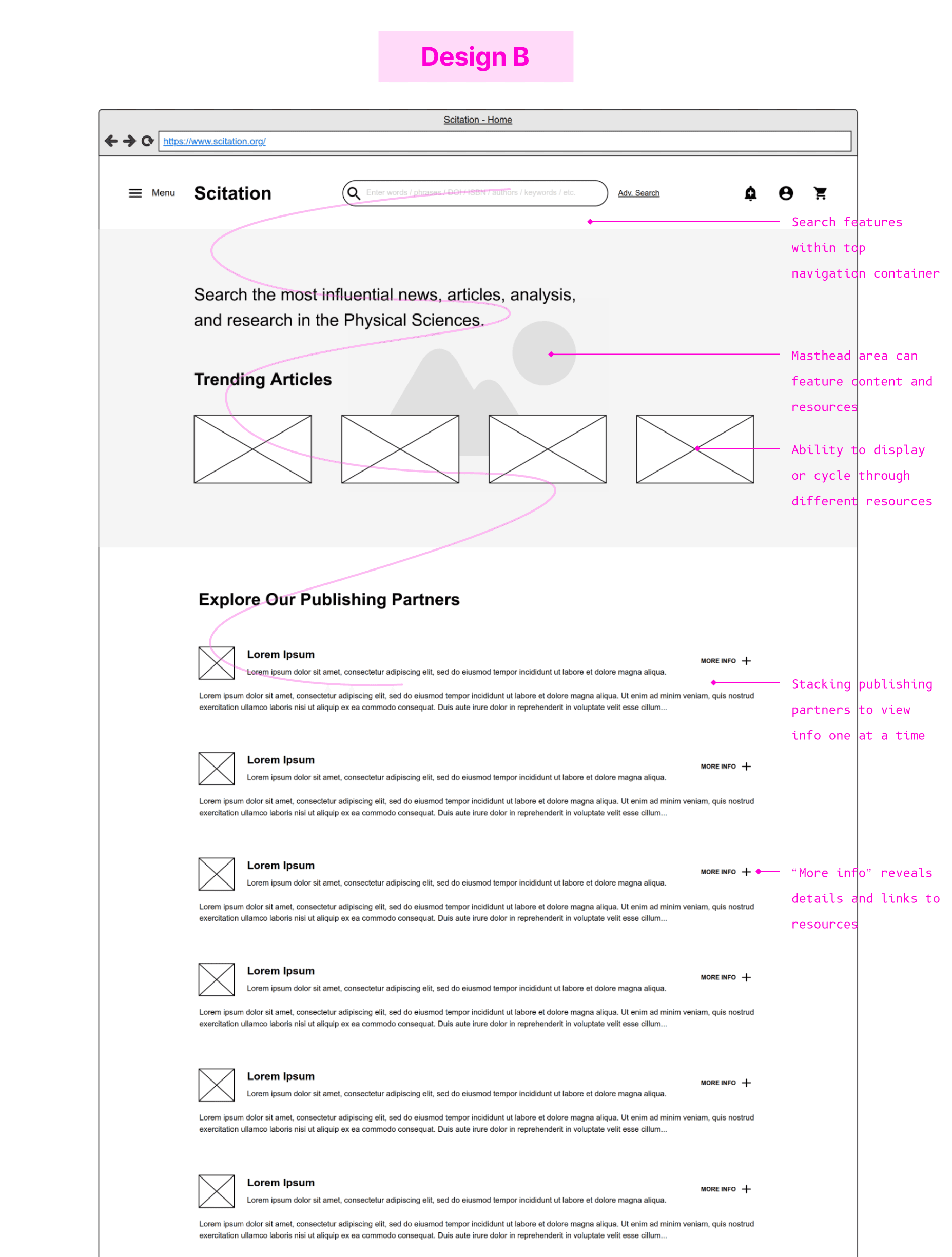
Moving search functionality in a top navigation bar allows for immediate visibility into key resources.
Introduces a learning curve for returning users who rely on the page for search.
A/B Testing
With limited access to users for testing, I instead gathered feedback from internal stakeholders. I met with individuals from product and marketing teams and asked them to complete tasks from the role of a key user across both designs.
Stakeholders valued the familiarity and low friction of Design A. However, Design B generated more engagement and aligned with long-term goals for discoverability.
The Result
Design B was selected for implementation – it had more potential to improve engagement and modernize the experience.

3
Design Process
Layout & Responsiveness
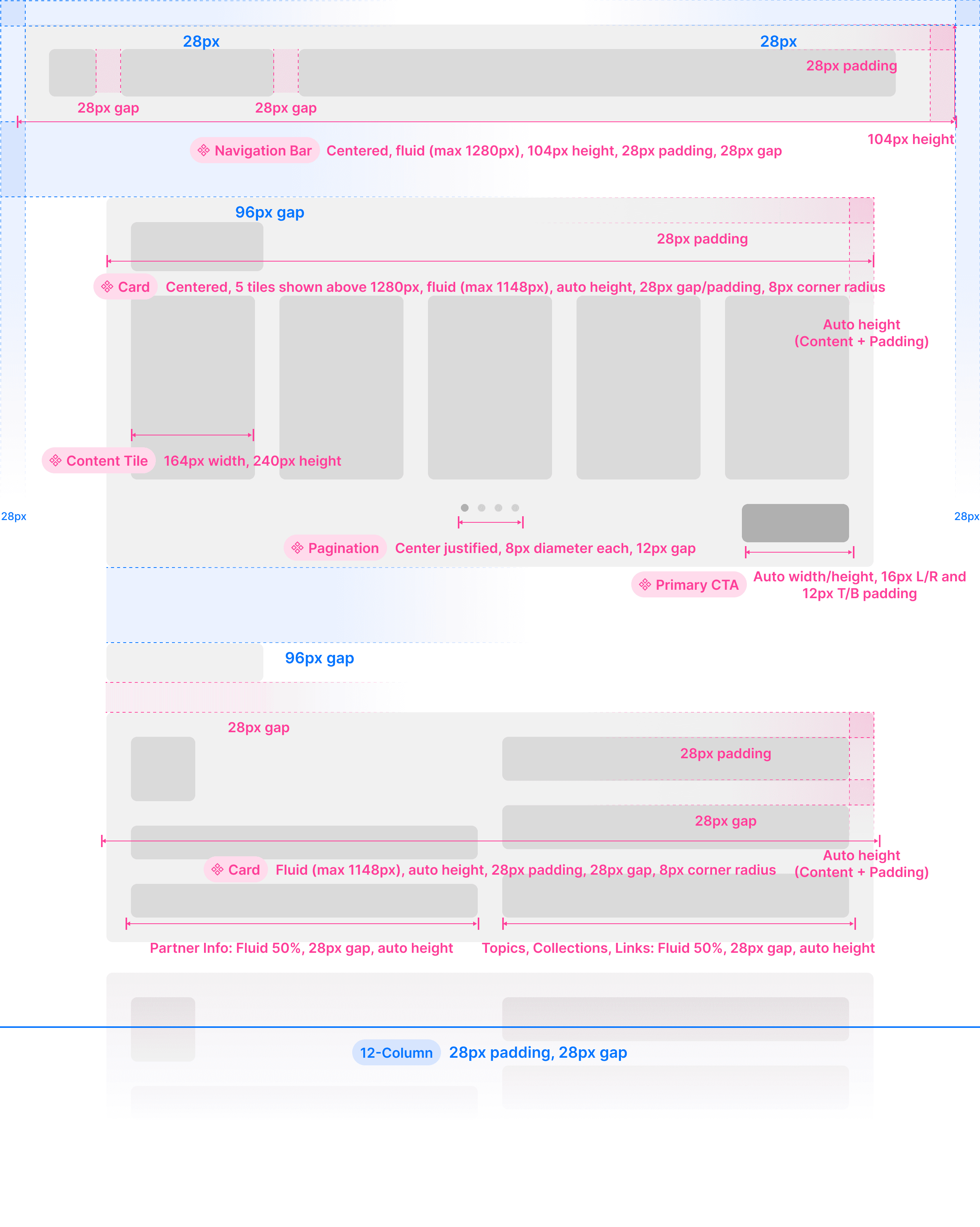
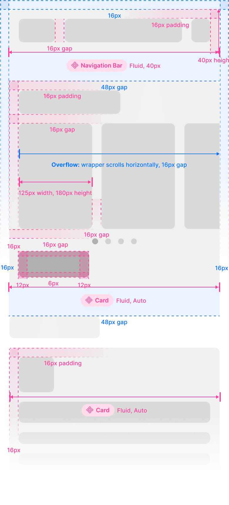
With validation behind Design B, I moved into refining the wireframe into a production-ready layout.
I created large and small breakpoint layouts, annotating specs, spacing, and responsive behavior.
Completely New Look & Feel
The marketing team wanted a new look for the entire platform. I defined a visual system with components, typography, and color tokens, which would scale across future pages.

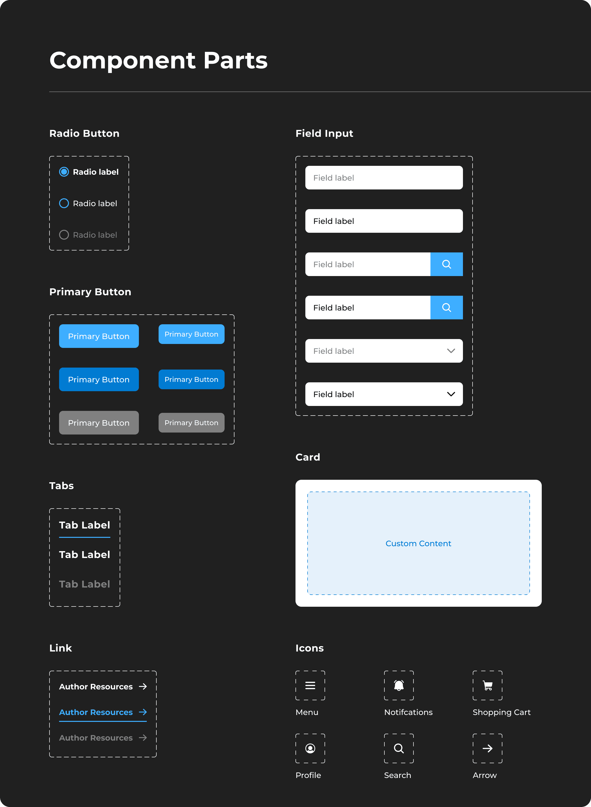
Consistency & Scalability
I created components in Figma to ensure structural consistency across a growing range of content and different content types on the landing page.
For developers, this meant interpreting less one-off layouts or inconsistent functionality in handoff.


4
High-Fidelity
Refreshed Design
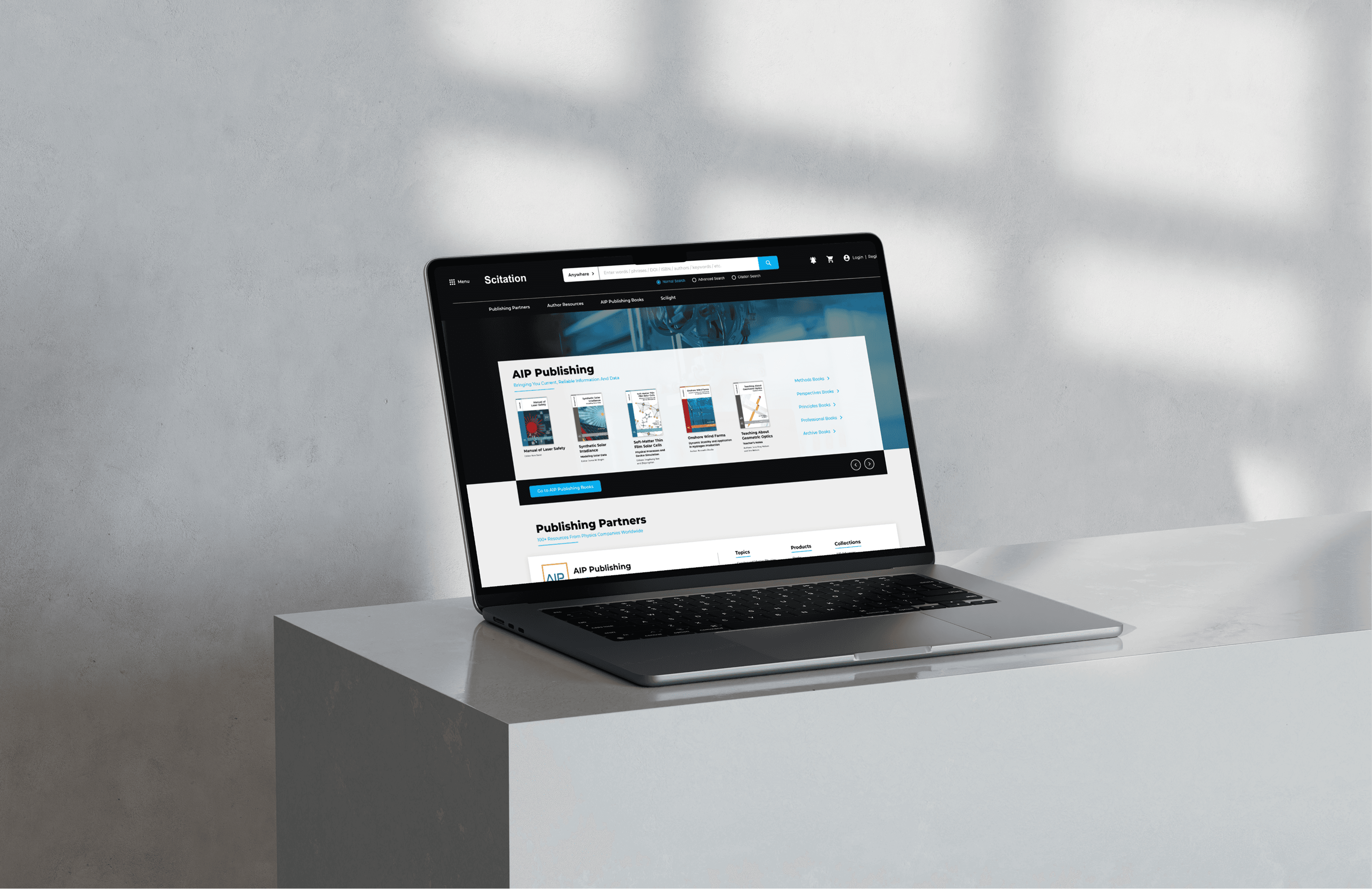
I transformed the landing page from a search-dominated page into a complete experience that elevated partner visibility and product discovery.
I also improved search by combining separated filters into an all-in-one search bar, allowing users to fine-tune their search for more precise results from the landing page.
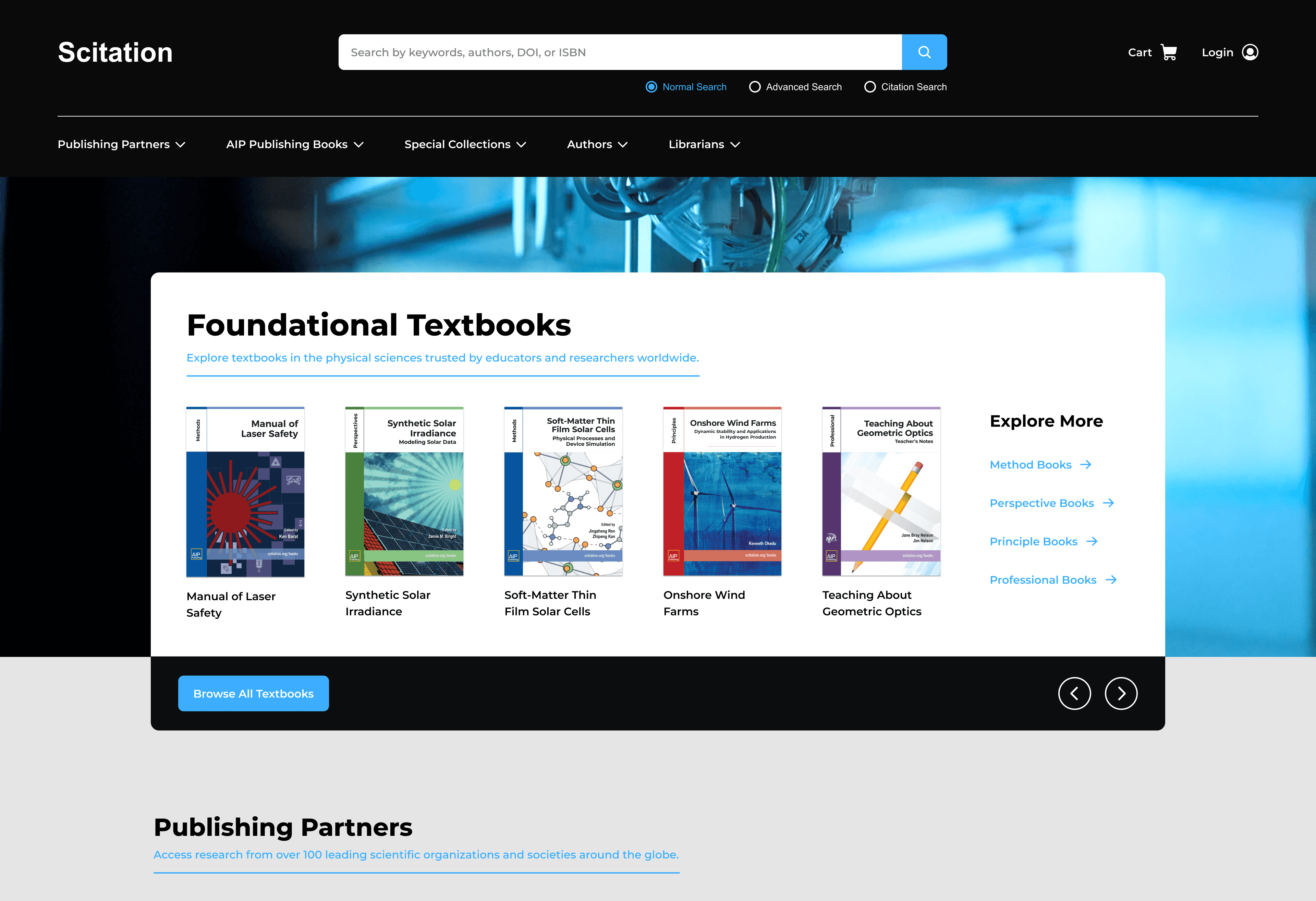
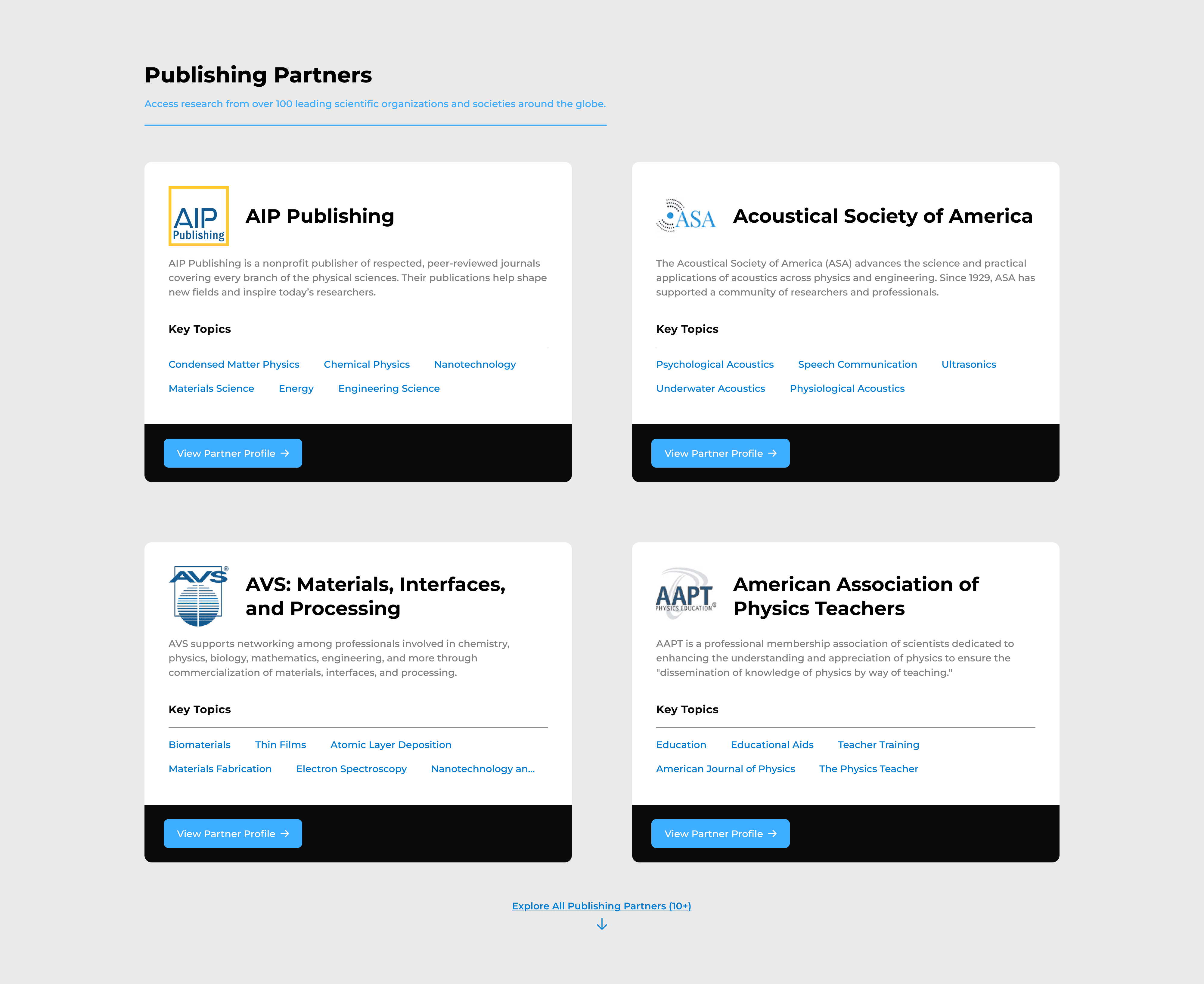
Clear & Glanceable
Previously, each Publishing Partner filled the screen with dense articles and links. This was contributing to user frustration and drop-off rates.
I organized each partner into cards, showing only key resources and information. This provided speed and clarity while maintaining access to in-depth research.
5
The Results
Outcomes & Impact
I presented my research and high-fidelity prototype to stakeholders in technology. Creating a system of design tokens and components helped streamline the demonstration and handoff.
User Engagement
60%
more clicks on resources in testing from surfacing key content.
Optimized Page
80%
reduction in scrolling, helping users find what they needed faster.
Personal Takeaways
This project demonstrated the value of setting design goals early and leveraging internal feedback. It helped ensure the final design addressed real usability needs while aligning with business goals.

0
